Guidelines for Selecting Optimal Hues for Picture-Perfect Outfits
In the world of professional photography, the right choice of colours can make all the difference in creating a stunning portrait. Here are some tips to help you make the most of your upcoming photoshoot.
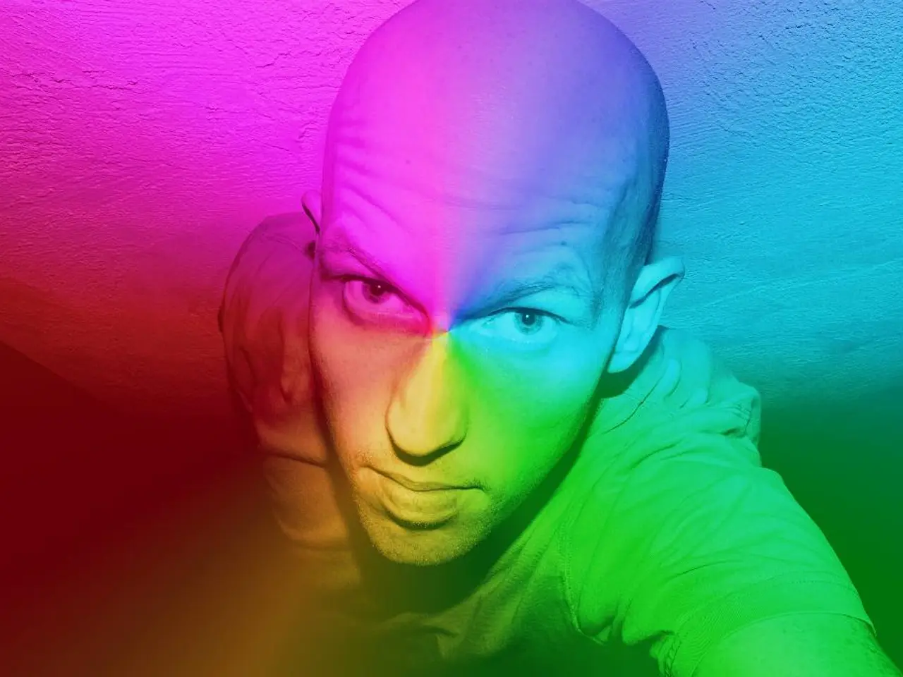
Firstly, understanding your skin tone can help you pick colours that complement you best. To determine cool or warm tones, examine the underside of your wrist and check the color of your veins. Blue veins indicate cool tones, while green veins suggest warm tones.
When it comes to professional headshots, deep reds, shades in the blue-green family, and grays are some of the best colours to consider. However, pale pastels and whites can wash out skin, especially on fair-skinned individuals. To balance these, it's recommended to use a bolder base makeup colour or a warmer blush.
For individuals with hazel eyes and naturally coloured hair, neutral-toned colours may be a good choice. Light pink and other light colours, excluding super stark or vibrant hues, are suitable for neutral-toned people.
When it comes to clothing for your photoshoot, it's best to bring multiple options to ensure the best possible results. Complementary colours can be beneficial when layering for a photography session. Some effective colour combinations include blue and orange, yellow and purple, green and neutrals, rose and cherry red, and yellow accents with neutrals or dark tones.
Avoid strong patterns, logos, graphics, and accessories for photography sessions, as they can be distracting and difficult to retouch.
The colours you choose should also consider the psychological impact and personality they convey. For example, blue and orange create striking contrast and visual interest, with blue conveying calmness and trust, while orange adds friendliness, energy, and fun. Yellow and purple reflect both cheerfulness and imagination, suitable for creative or thoughtful personalities.
General principles to remember include using contrast and complementary colours to make the subject pop and add depth to portraits. Colour temperature affects mood; warm tones (like golden light) create intimacy and nostalgia, while cool tones suggest calmness or mystery. Choose colours aligned with the personality you want to convey—for example, green for groundedness and care, purple for creativity, orange for enthusiasm.
For seasonal portrait colours, consider the following: Spring - pale pink, mint green, baby blue, cream, light gray, soft yellow, spring green, lavender; Summer - white, yellow, bold red, bright orange, bold pink, turquoise, royal blue; Fall - brows, mustard yellow, burnt orange, dark shades of green, dark purple, neutrals; Winter - white, cream, brown, black, medium to dark gray, ruby red, dark purple, emerald green, blue.
Lastly, stay away from sleeveless tops, low necklines, and turtlenecks for headshots, as they can make the shoulders look wider, be distracting, or create a floating head effect.
For those based in Atlanta, a free consultation is available for those interested in working together. Consult additional resources for more information about what to wear for portraits, what to bring to a photo session, and how to prepare for a portrait session.
When selecting clothing for a lifestyle photoshoot focusing on fashion-and-beauty, consider bringing multiple options that incorporate complementary colors for effective color combinations such as blue and orange, yellow and purple, green and neutrals, rose and cherry red, and yellow accents with neutrals or dark tones.
In the realm of education-and-self-development, understanding the psychological impact of colors can aid in conveying the intended personality for portraits. For instance, blue signifies calmness and trust, while orange adds friendliness, energy, and fun.


